There’s a quiet kind of elegance in warm neutrals—a softness that doesn’t demand attention, yet lingers in the most beautiful way. These are the colors that feel like sunlight on linen, like worn wood under your fingertips, like a space that has nothing to prove. Effortlessly chic, they create a room that feels calm, refined, and deeply inviting without ever trying too hard.
A warm neutral palette isn’t empty or plain. It’s layered, nuanced, and full of subtle depth—the kind you only notice when you slow down and really look.
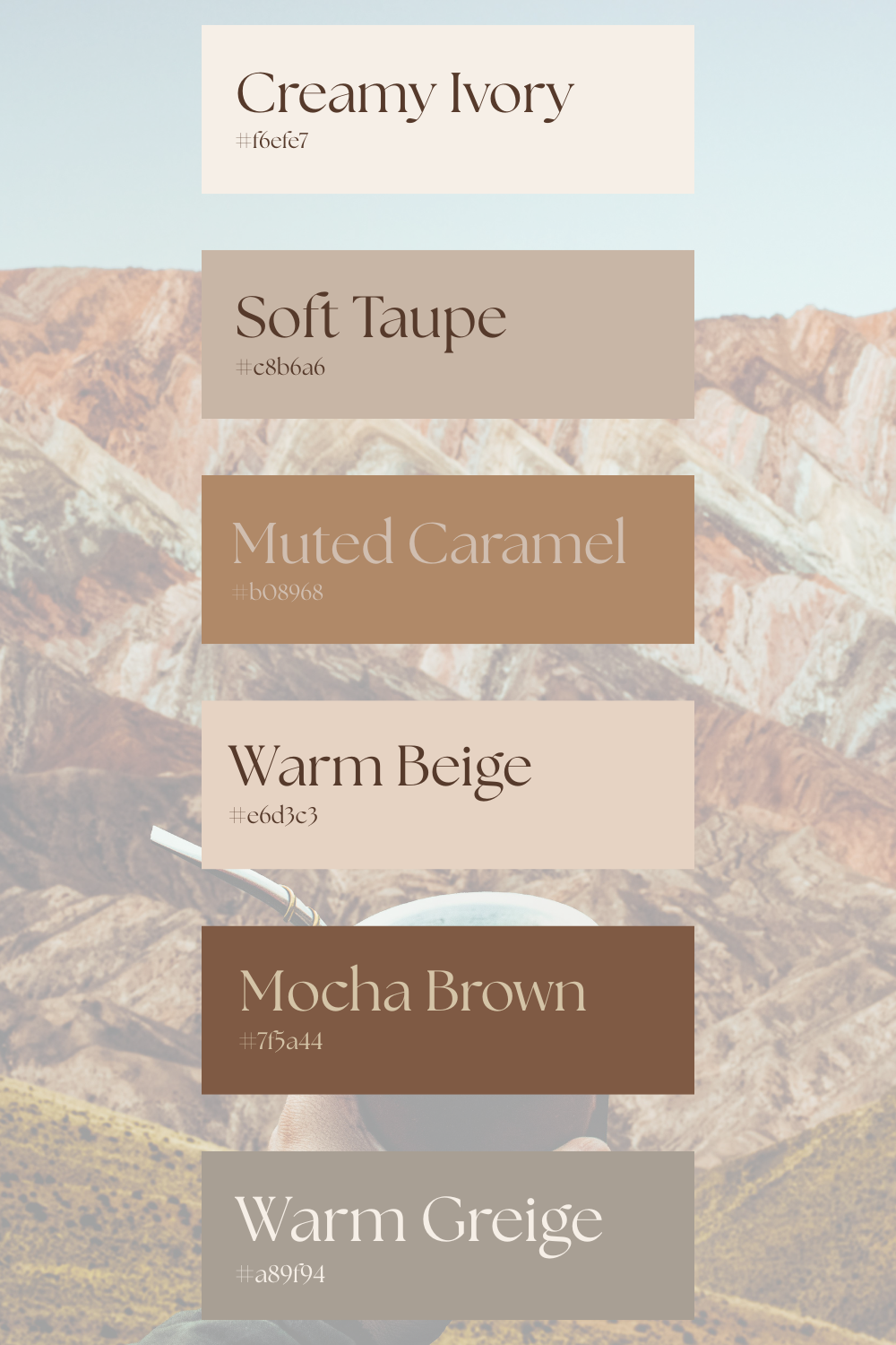
Base Tones
Every serene space begins with a gentle backdrop.

A light, glowing neutral that softens everything around it. It reflects light beautifully and creates that airy, open feeling without feeling stark.

Slightly deeper, like sun-warmed sand. It adds quiet warmth and keeps the space from feeling too pale or washed out.
Use these tones on walls, larger furniture, or rugs to create a calm, cohesive base that everything else can rest on.
Mid Tones
This is where the palette begins to feel lived-in and layered.

Balanced and grounding, taupe sits gently between beige and gray, adding sophistication without heaviness.

A warm, honeyed tone that brings a subtle richness, like aged leather or polished wood.
These shades work beautifully in upholstery, bedding, or accent furniture, giving the room a sense of quiet structure.
Accent Tones
To keep the palette from feeling flat, a few deeper tones create contrast—softly, never sharply.

Deep and comforting, like a strong cup of coffee in the afternoon light. It anchors the room without overpowering it.

A subtle blend of gray and beige that adds a modern softness while still feeling warm and timeless.
Use these in smaller details—frames, textiles, or decorative accents—to create dimension.
Layering
The beauty of warm neutrals lies in their ability to blend seamlessly. Instead of sharp contrasts, think of gentle transitions.
- Keep the palette within the same warm undertone family
- Let lighter tones dominate, with deeper shades appearing in smaller doses
- Mix textures to separate similar colors—linen against wood, matte against soft sheen
The goal is for everything to feel connected, like different shades of the same quiet story.
Placement
Creating a chic neutral room is as much about placement as it is about color.
- Walls: Creamy ivory or warm beige for a soft, glowing backdrop
- Sofa or bed: Soft taupe or warm beige to anchor the room
- Throws and cushions: Muted caramel and greige for layered warmth
- Furniture accents: Mocha brown in wood or small decor pieces
- Rugs: A blend of ivory and taupe to tie everything together
Let each element flow into the next—nothing should feel abrupt or out of place.
Why It Works
Warm neutrals don’t rely on boldness to make an impact. They work quietly, creating a space that feels balanced, calm, and naturally refined. The softness of the tones, the harmony between shades, and the subtle layering all come together to form a room that feels complete without feeling overdone.
It’s the kind of palette that doesn’t chase attention—but holds it, gently.
You might enjoy:
The Psychology of Cozy: Why Your Room Might Be Making You Stressed
Leave a Reply